Gendered Differences in Migration
11.154 Big Data and Visualization Final Project - Collaborators: Meera Gregerson, Kwesi Afrifa, Sarah Lohmar
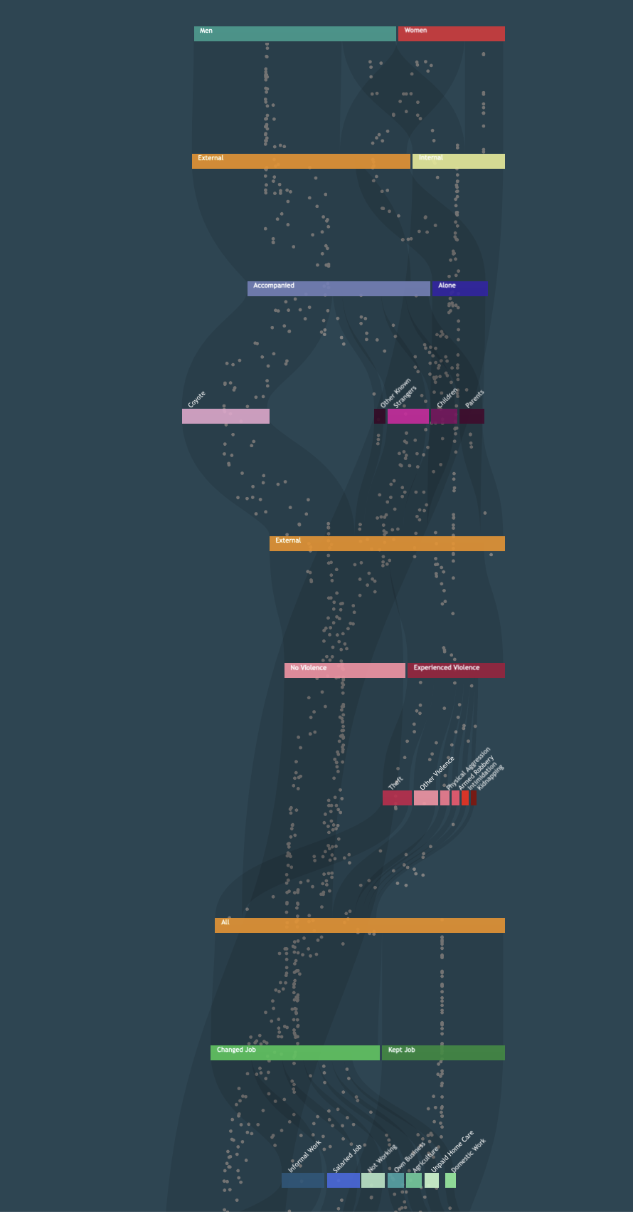
In 2021, the World Food Program (WFP) and the International Organization for Migration (IOM) collected survey responses from approximately 5000 households in Honduras, Guatemala, and El Salvador to examine why people migrate. Our task was to explore a subtopic within the large dataset and construct a desktop web data visualization. We chose to unpack how female and male migrants represented in the data have different experiences due to their gender with an interactive vertical sankey diagram to suggest the movement of people through key stages of the migration process. We also wanted our project to serve as a reminder that each migrant is more than just a survey response. My contribution to this project was designing and styling the diagram and integrating the survey data into the diagram using HTML, CSS, Javascript and D3. With my planning and computer science background, I’m interested in how data can be used to tell compelling stories and narratives about pressing issues.


